


Problem statement
The Public Distribution Shop (PDS) suffers from a slow ration distribution process and a clunky interface on its E-POS system, leading to a long customer queue and poor user experience.
About PDS POS
The PDS POS Project revolutionizes ration distribution at Public Distribution shops with an innovative redesign which saves users time by up to 80%. By addressing challenges like slow processes, clunky interfaces, and small displays, the project introduces a 'Instant Aadhaar number auto-refill' system and an intuitive interface. This user-centric solution streamlines distribution, reduces cognitive load, and enhances the overall experience.

What's new
Meet the features that make this interface engaging, Immersive, comfortable, and intuitive while reducing error.

"The details are not the details. They make the design"- Charles Eames
A detailed case study ahead
An Academic Project
Display and Control
Project Title
PDS POS: Redefining the distribution experience
Project duration
7 weeks
[ PDS POS ]
Design Brief
To redesign the E-Pos machine and its interface, used at the Public Distribution Shop, to reduce the distribution process time and make the device more intuitive and interactive.
IDEO Design Process

Background
India's public distribution system (PDS) is the largest distribution network of its kind in the world. Around 5.5 lacs (0.55 million) licensed Fair Price Shops (FPS) or Public Distribution Shops distribute subsidized food grains to 80 crores (800 million) people every month at a fair price. Until 2016, the process involved authenticating customers through identity cards and manually maintaining the point of sale in the official register. The government introduced an E-pos machine to digitize the process. While many dealers received device operation training, some still face challenges adapting to the new technology, resulting in a less satisfactory user experience with the device.
who is the user?
The users are licensed public distribution shop dealers and their nominated family
Context of use
Public distribution shops in both urban and rural contexts
EMPATHIZE
Research plan
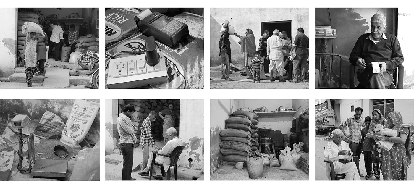
For research, I conducted interviews with three device users from different villages. During the interviews, I took notes, used a camera, and recorded audio to collect firsthand information. This research plan helped me gather valuable insights from real users and understand their experiences better.
Research Respondents
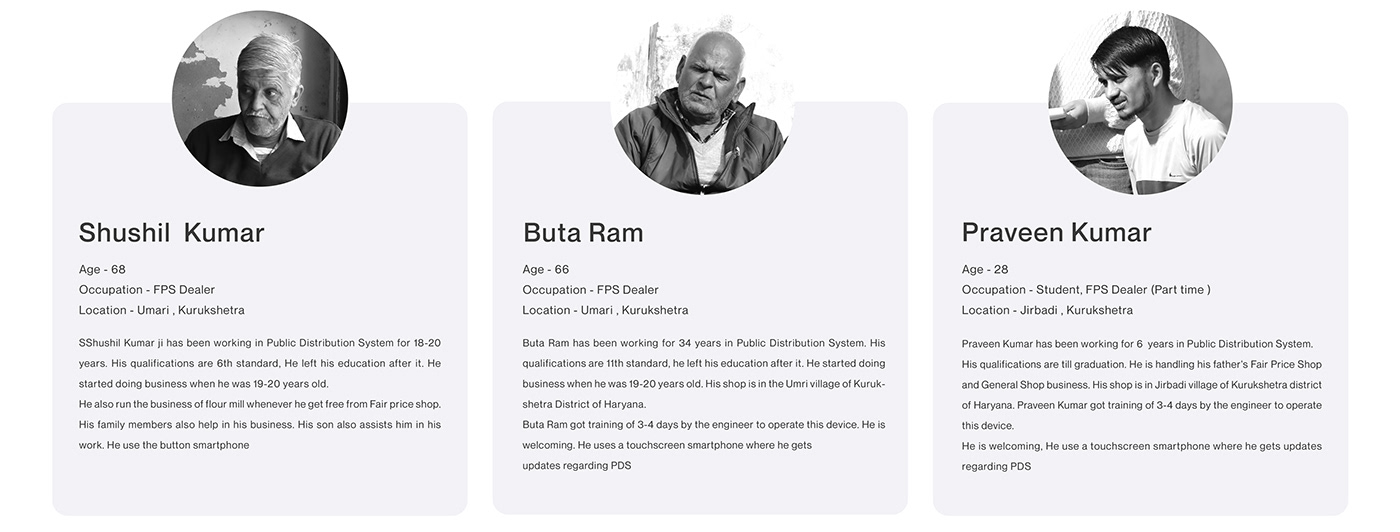
Data Collection

About Product
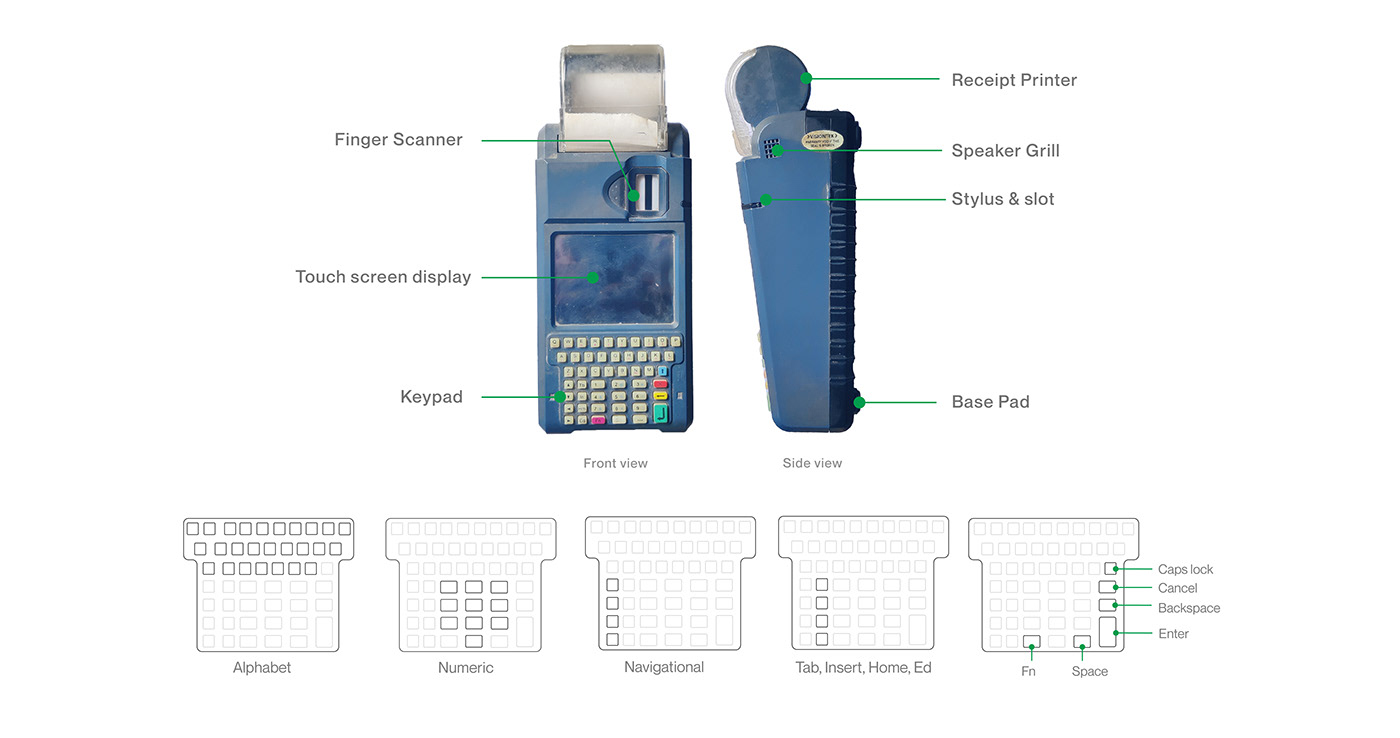
Old Interface
Arranging all the screens of the interface from logging in to distributing ration in order, so that I could look back to the reference while analyzing the process later on

Empathy Map
An empathy map is an efficient tool for understanding users' behavior by what they say, think, feel, and does.

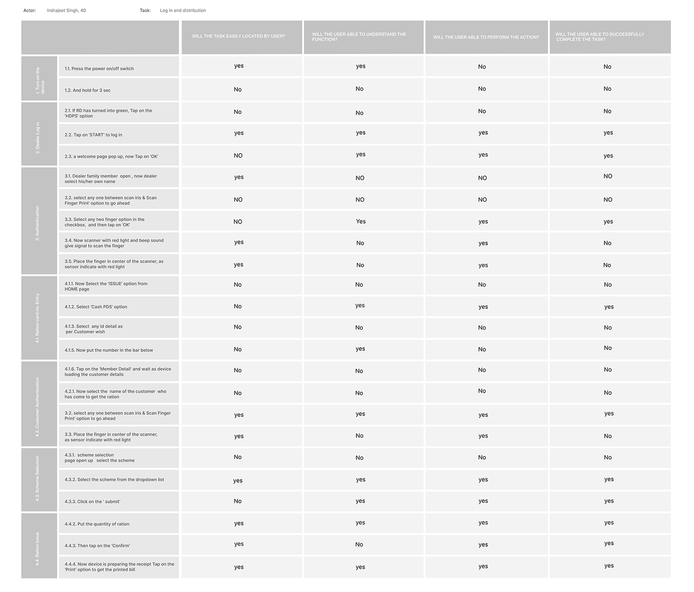
Task Analysis
I conducted Task Analysis to understand user actions and the sequence of steps required to complete a task. The goal was to break down the tasks into smaller steps. This analysis provided valuable insights into areas where the user experience could be improved.

DEFINE
Cognitive Walkthrough
Once broken down the task into smaller steps, conducted a Cognitive walkthrough to evaluate the interface's intuitiveness and whether it aligns with users' mental models and expectations during interactions.
Heatmapping
Heatmaps provide real user data that help to validate design decisions—built the map of all the controls that get operated from switching on the device to logging in to the app to distributing Ration to identify use patterns and frequency.

Heuristic Evaluation
Heuristic evaluation is a method, I used this to find usability flaws in the interface. Since I was new to this tool, I performed this evaluation under the guidance of my mentor.

Problems area
The current distribution process takes a lot of time and causes customers to wait in the queue due to several factors including distribution processes for each scheme, errors caused by mistyped card numbers, and prolonged transactions due to excessive touch counts.
The current receipt system lacks the option to inquire whether the customer wants a receipt or not, leading to the automatic printing of receipts that may result in unnecessary paper waste
There are many fundamental problems in user interface Inconsistent use of color for elements like buttons, text, containers, etc, a lack of text hierarchy, poor iconography, confusing layout, unaligned elements and the text-heavy interface overwhelms users, leading to disengagement
The absence of a battery power status indicator on the device presents a usability issue, as users are unable to monitor the battery level or estimate the time required for a full charge.
The small screen size presents a challenge as it causes information and app content to appear congested, making it difficult for users to access and comprehend the displayed information effectively.
User Persona

IDEATE
New Information Architecture
After identifying users' needs, design a new information architecture. I organized all the pages in sequence. New IA serves the is the simpler and more intuitive experience of ration distribution.
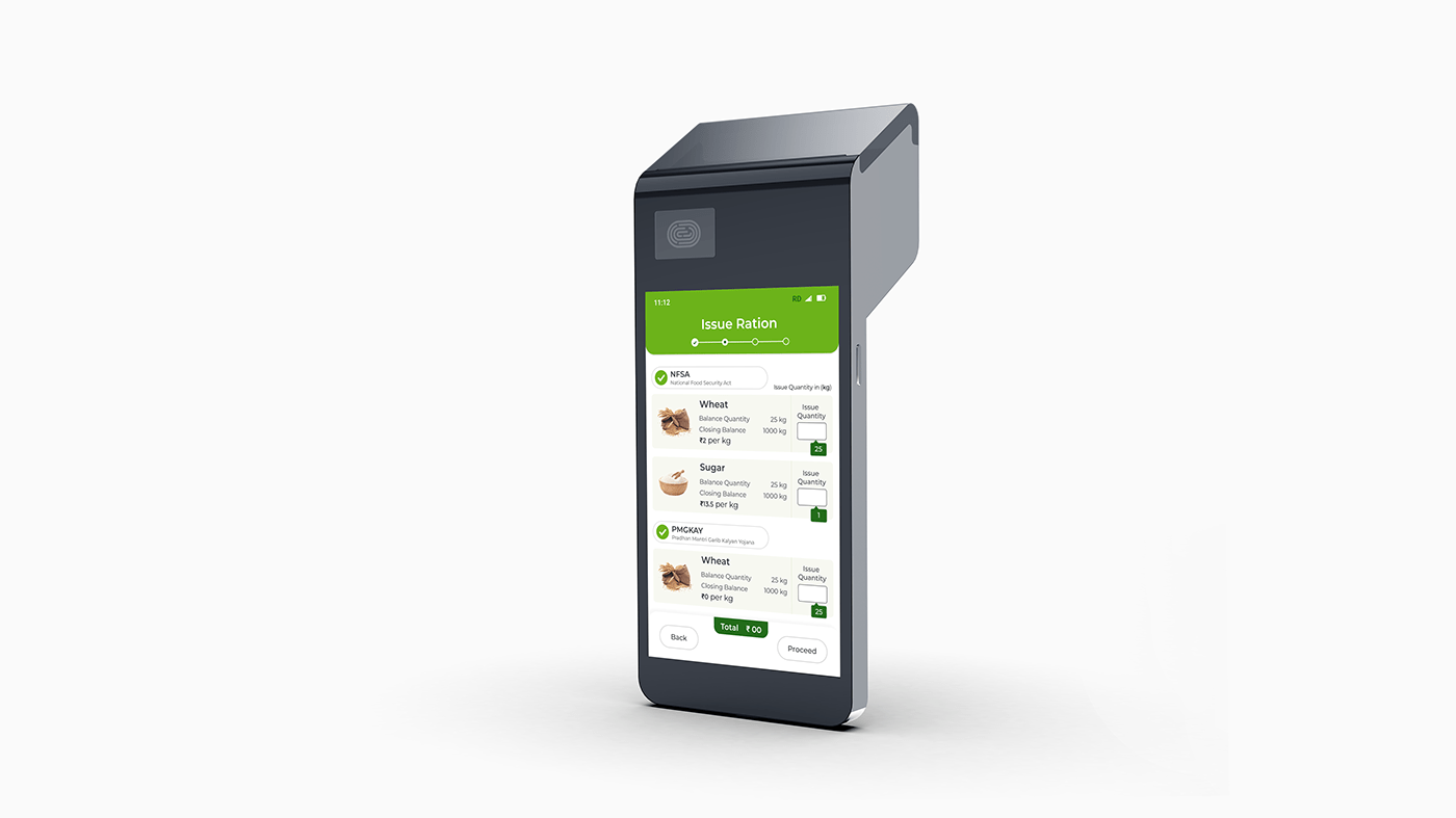
The process of distribution has been categorized into four steps
1. User will authenticate the customer
2. User will allocate the quantity of the ration
3. Choosing Payment modes
4. Inquiring for Receipt

Task Flow
After building the information architecture, mapped out the user journey from logging in to the application to printing the receipt. I made the navigation easy to understand the action and sequence as well as I also incorporated the system thinking of possible use case scenarios.

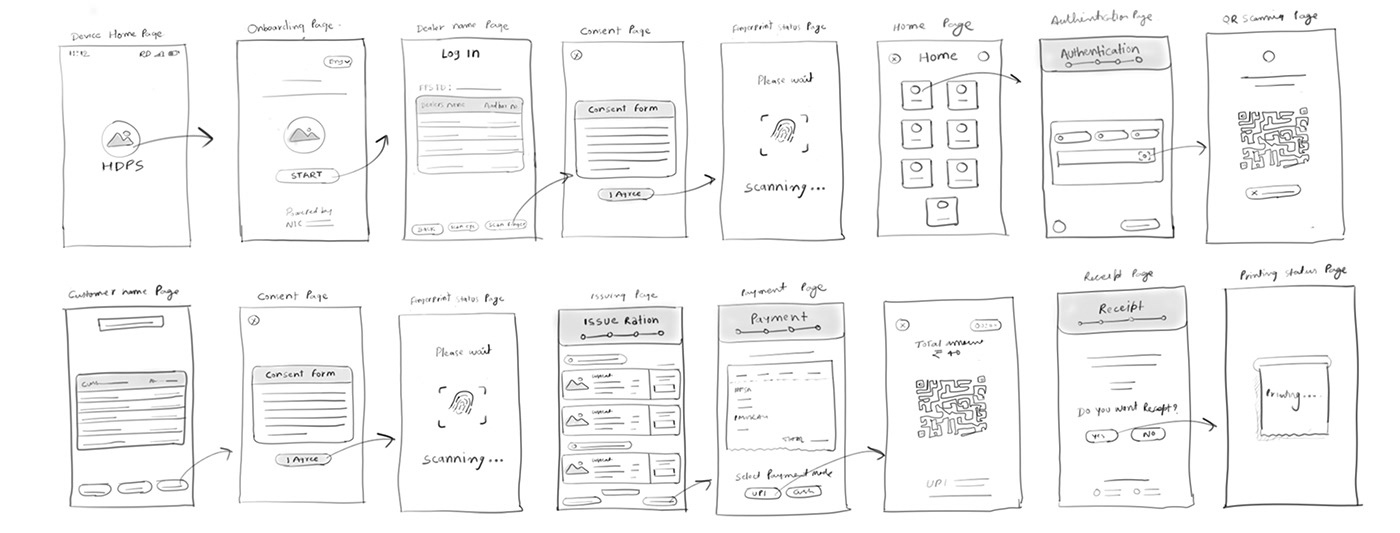
Sketches
Alongside the information architecture and user flowchart, I sketched my ideas keeping in mind the user’s pain points and motivations.
PROTOTYPE
Mid-fidelity wireframe
A mid-fidelity serves as a crucial bridge between the initial concept and the final product, undergoing multiple changes. It involves crafting the layout and placing fonts, and graphics details with basic shapes to ensure effective communication.

TEST
User Testing
In the last phase of the design process, I engaged real users within their natural settings to interact with the new design of the product and interface. By closely observing their interactions and gathering valuable feedback through three iterative cycles, I validated design choices based on user input, ensuring a user-centered final design.


High-fidelity wireframe & Visual style guide
Created a set of visual guides with legible typography, minimal and contemporary UI elements, and a calm and harmonious color palette. This comprehensive guide also offers animation, illustrations, and pictures which create an immersive user experience

3D visualization
Thank you!


